Nuance Messaging UI Framework
Nuance Messaging UI framework exposes a fully functional Messaging UI viewController that can be launched from your application. Framework exposes custom UI properties which allows App developer to customize the look and feel of the Messaging UI.
- Launching ViewController
- Plain Bubble View
- Styling Send Button
- Styling Customer Input Field
- Styling Footer Separation Bar
- Styling Title Bar
- Styling Transcript View
- Styling Transcript bubbles using background Image
- Styling Speech bubbles view
- Styling Email Dialog
- Styling Loading View
- Messaging App String Properties
- Displaying customer/Agent name in bubbles
- Displaying and styling timestamp
- Styling File Upload screen
- Customizing VA resposne
- Displaying disclaimer header
- Display Survey Confirmation Dialog
- Additional Typing Customization
- Hidden messages
Nuance UI Framework exposes methods to initiate a new engagement session aswell as to restore an existing engagement session.
public func launchMessagingViewController(params: EngageParameters)
params: Engage Paramters needed to create an engagement.
| siteID | SiteID parameter is mandatory to create an engagement. |
| businessUnitID | Mandatory Business Unit ID to check agent availability and HOP availability. |
| agentGroupID | Mandatory AgentGroupID which is required for a new engagement. |
| businessRuleID | Mandatory Business rule ID is used to tie this engagement to a business rule for reporting purposes |
| openerText | Opener message that will be added to transcript upon agent assign. |
| opID | ID of the Opener message that is configure is portal. |
| brName | BusinessRuleName parameter is optional. |
| autoID | Associated automation ID with this engagement request. |
| pageID | Page Marker ID where an engagement starts. |
| prioity | Initial engagement priority of the engagement request. A higher number indicates a higher priority in the queue |
| qmSpecID | The ID of the queue messaging spec as identified in TouchPortal. If the queue messaging spec is valid, it will pull the proper queue message and display it as message text when the API caller calls the Get message API call. |
| qt | Queue threshold value for engagement. Used to calculate whether this engagement goes into the queue in cases where agent slots are not available. |
| scriptID | ID of the agent’s scripts for this engagement. |
| dataPass | Datapass information for this engagement in name value pair. |
| agentAttributes | Agent attribute information used for this engagement. |
| isAsyncEngagement | Set the value to true if this is an asyncronus engagement. |
| customerName | Value of this parameter will be displayed in the customer bubble. Refer "Displaying Customer/Agent name in bubbles" section of this page |
| autoDataPass | Use this field to pass automaton Datapass. |
| agentAssistedCount | Use this field to set the minimum number of agent message to be qualified for assisted criteria. |
| customerAssistedCount | Use this field to set the minimum number of customer message to be qualified for assisted criteria. |
| pcs_agent_count | Use this field to set the minimum number of agent message to be qualified for post chat survey. |
| pcs_customer_count | Use this field to set the minimum number of customer message to be qualified for post chat survey. |
| emailSpecID | Use this parameter to configure the email spec settings. |
public func restoreMessagingViewController(webview: WKWebView?)
webView parameter is optional and only need to be passed if there is a webview involved in this engagement request.
public func launchMessagingViewControllerForHybrid(paramsDict: Dictionary
This method must be used when engagement is requested from the Nuance BR JS engine running within webView page
paramsDict: Pass the engageparameter dictionary provided by the handleWebviewRequest andNewEngagementHandler callback(refer hybrid section of this document)
Below Function lets you close the messaging window from outside the SDK. This method is accessible from the instance returned from launchMessagingViewController
closeAndDismiss()
Below Function lets you minimize the messaging window from outside the SDK. This method is accessible from the instance returned from launchMessagingViewController
minimizeScreen()
Below Function lets you change the title after an engagement is created.This method is accessible from the instance returned from launchMessagingViewController
updateMessagingTitle()
Below Function lets you change the logo after an engagement is created.This method is accessible from the instance returned from launchMessagingViewController
updateMessagingLogo()
Below Function lets application to display a typing mesage /animation programatically.This method is accessible from the instance returned from launchMessagingViewController
displayAgentTyping()
Below Function lets application to add a message on to the chat window programatically.This method is accessible from the instance returned from launchMessagingViewController
addMessageToChatWindow()
Below Function lets application to add a system message on to the chat window programatically.This method is accessible from the instance returned from launchMessagingViewController
addSystemToChatWindow()
Below Function lets application to clear a system message.This method is accessible from the instance returned from launchMessagingViewController
clearSystemFromChatWindow()
Below Function lets application to add a custom VA message on to the chat window programatically.This method is accessible from the instance returned from launchMessagingViewController
addCustomVAMsg()
Below Function lets you check the state of the chat.
NuanMessaging.getInstance().getChatProgress()
Below Function lets you check the SDK version.
NuanMessaging.getVersion()
Below Function to set the SDK timeout for an active engagement.Engagement can be timed due to application being in background or messaging window is minimized but application is not pooling for agent messages when minimized. This timeout should be less than or equal to chat router timeout set in portal
NuanMessaging.getInstnace().setEngagementTimeoutInSeconds()
Below Function lets you Override the nuance domain SDK is pointing to. This must be called prior to the call to initialize method.
NuanMessaging.getInstance()?.overrideAPIDomain()
NuanMessaging.getInstance()?.overrideAuthDomain()
By passing an instance of NuanceMessagingDelegate class to below method lets application to listen to various SDK events.
public func setMessagingDelegate(delegate: Any)
onMinimized(): SDK fires this method when Messaging Window is minimized.
onClosed(): SDK fires this method when Messaging Window is closed.
onAgentAssigned(): SDK fires this method when an agent is assigned.
onNinaExternalLink(): SDK fires this method when Nina VA does a handoff to application to display Application screens.
onDisplayed(): SDK fires this method when Chat is rendered and visible to user.
onError(): SDK fires this method when input field is disabled during the engagement preventing user from typing. Cases when input field is disabled are network disconnect, agent Left engagement, chat router timeout, engagement is denied etc
onCustomerMessage(): SDK fires this method every time customer send a message.
onVAMessage(): Allows application to listend to virtual agent message.
onEngagementCreated(): SDK fires this method when an engagement is created.
onEngagementEnded(): SDK fires this method when an engagement is ended.
onConversationResolved(): SDK fires this method when a conversation is resolved.
Handling Minimized state of engagement
User should be provided with a feedback of new agent messages when messaging window is minimized. Once the messaging window is minimized its application responsibility to query for new agent messaging within the application viewWillAppear method, as user navigates from one screen to another this code should be reexecuted for every screen user is in.
  /**
      You must initialize the GetMessageAPI in your viewController viewDidLoad method.
  **/
  override func viewDidLoad() {
        super.viewDidLoad()
        self.message = GetMessageAPI.getInstance();
      }

/**
  To continue receiving agent message while in minimized state and to display a restore button,
  refer the following code snippet
**/
override func viewWillAppear(_ animated: Bool) {
        // Check if there is an engagement session in progress
        if(NuanMessaging.getInstance().getChatProgress()) {
        //continue pooling for new agent messages , also can display a restore button here
            self.message.getMessages({ (response, error) in
              //If there is a new message from agent, handle it by showing a counter on the restore button or a notification prompt etc
              //In case if agent closes the session , need to add the following code so that webview is notfied accordingly in case of hybrid engagement
              //also app can hide the restore button and display chat live button.
              if(response?.messageType == "chatLine") {
                    ChimeSound.sharedInstance.playSound()
                }
              else if(response?.messageType == "stateChange") {
                    let stateProp:String! = "state"
                    let stateText: String! = "display.text"
                    if(response?.getProperty(stateProp) == "closed") {
                        DispatchQueue.main.async {
                            self.webView.evaluateJavaScript("window.top.inqFrame.Inq.FlashPeer.closeChat()", completionHandler: nil)
                        }
                    }
                }
            })
        }

    }


 override func viewWillDisappear(_ animated: Bool) {
 //Very important to cancel the GetMessage pooling when viewController is about to disappear and moves to new viewController
        if(NuanMessaging.getInstance().getChatProgress()) {
            message.cancelGetMessages()
        }
    }
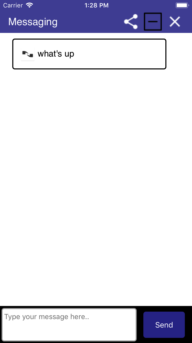
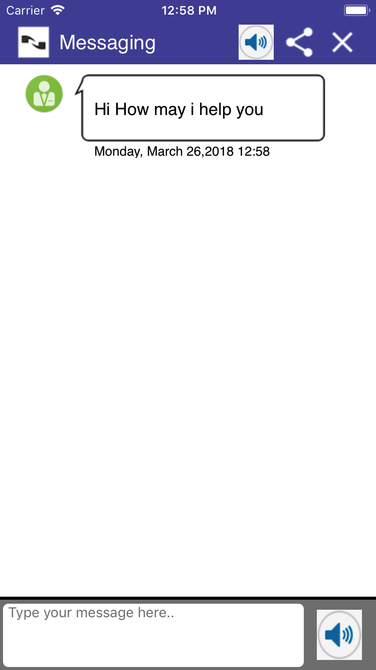
Plain Bubble View in Converstation Screen
Plain bubble Converstation View along with an optional Icon for agent is the default view displayed for Messaging UI.
Styling Send Button
Properties to customize send button is exposed from SendButtonProperties class. Application has to pass an instance of this class having modified properties into the framework.
public func setSendButtonProperties(properties: SendButtonProperties)
Following properties in SendButtonProperties lets you change the look and feel of Send Button.
| Name | type | default | description |
|---|---|---|---|
| borderColor | UIColor | UIColor.white |
Use this property to change the send button border color |
| borderWidth | Int | 0 | Use this property to change the border width. |
| cornerRadius | Int | 5 | Use this property to change the corner Radius. |
| buttonTitle | String | Send | Lets you change the Send button label. |
| backgroundColor | UIColor | UIColor(red: 50.0/255.0, green: 53.0/255.0, blue: 149.0/255.0, alpha: 1.0) | Change background color of send button. |
| textColor | UIColor | UIColor.white | Change the send button label foreground color. |
| gradientEffect | [UIColor] | [UIColor.white, UIColor.white, UIColor.white] | Lets you add a gradient effect to button. |
| gradientEffectLocations | [NSNumber] | [0.0, 0.0, 0.0] | Lets you add the location of gradient effects. |
| useGradientEffect | Bool | false | you must change it to true to have the gradient take effect. |
| buttonImageData | Data | Nil | Lets you set an image as the background to send button. buttonTitle won't have any effect when you set an Image. |
| disableImageData | Data | Nil | Lets you set an image as the background to send button.This will be displayed when SDK disables send button |
| buttonWidth | Int | 80 | Lets you set the width of send button. |
| buttonFieldRightMargin | int | 14 | Lets you set the send button right margin |
| buttonFieldTopMargin | int | 4 | Lets you set the send button top margin |
| buttonFieldBottomMargin | int | 3 | Lets you set the send button bottom margin |
| buttonHeight | int | 0 | Lets you set the height of button image, setting button height make the top an bottom margin ineffective |
| toggleSendStateAfterMsgSend | boolean | false | Set the send button to disabled state when Customer Text input contains 0 chars. Button will move to enabled state as soon as customer start typing. |
Styling Customer Text Input Field
Properties to customize Customer Input field is exposed from CustomerInputFieldProperties class. Application has to pass an instance of this class having modified properties into the framework.
public func setCustomerInputProperties(properties: CustomerInputFieldProperties)
Following properties in CustomerInputFieldProperties lets you change the look and feel of Input Field.
| Name | type | default | description |
|---|---|---|---|
| hintText | String | Type your message here.. |
Lets you change the hint text displayed in the input field. |
| borderColor | UIColor | UIColor.white | Use this property to change the border color. |
| borderWidth | Int | 0 | Use this property to change the border width. |
| cornerRadius | Int | 5 | Use this property to change the corner Radius. |
| inputMessageBackgroundColor | UIColor | UIColor.white | Change background color of Input Field. |
| textColor | UIColor | UIColor.gray | Change text foreground color. |
| placeHolderColor | UIColor | UIColor.gray | Lets you change the hinttext foreground color. |
| containerBackgroundColor | UIColor | UIColor.gray | Lets you change the background color of the container where input text field and Send button is displayed. |
| dismissKeyBoardOnReturn | boolean | true | Lets you control the action that happens when user press return key. |
| sendMsgOnReturn | boolean | false | Lets application control if message need to send when pressing return key on keyboard. |
| inputFieldLeftMargin | int | 3 | Lets you set the input field left margin value. |
| inputFieldRightMargin | int | 13 | Lets you set the input field right margin. |
| inputFieldTopMargin | int | 4 | Lets you set the input field top margin. |
| inputFieldBottomMargin | int | 3 | Lets you set the input field bottom inputFieldTopMargin. |
| textFieldFont | UIFont | UIFont(name: kFontName, size: 14.0) | Lets you change the input field font size. |
| textFieldTopPadding | Int | 0 | Lets you change the input field top padding. |
| textFieldLeftPadding | Int | 0 | Lets you change the input field left padding. |
| textFieldBottomPadding | Int | 0 | Lets you change the input field bottom padding. |
| textFieldRightPadding | Int | 0 | Lets you change the input field right padding. |
| keyboardType | UIKeyboardType | UIKeyboardType.default | Lets you change the input keyboard type. |
isCharacterLimitRequired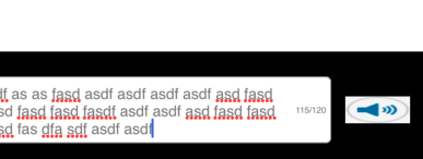 |
bool | false | lets you configure the display of character limit view when user engaged with VA. |
| limitDisplayThreshold | int | 100 | lets you configure the threshold at which character limit view displays. |
| characterLimitForVA | int | 120 | Maximum character that can be entered |
| characterLimitBottomPadding | int | 5 | Character limit view bottom padding |
| characterLimitRightPadding | int | 5 | Character limit view right padding |
| characterLimitTopPadding | int | 5 | Character limit view top padding |
| characterLimitViewWidth | int | 28 | Character limit view width |
| characterLimitTextColor | UIColor | gray | Character limit view text color |
| characterLimitTextFont | UIFont | UIFont(name: "Helvetica", size: 8) | Character limit view font style |
| inputTextAlignment | NSTextAlignment | NSTextAlignment.left | Allows application to set the input text alignment |
Styling Footer Separation Bar
Properties to customize Footer Separation bar is exposed from FooterSeparationProperties class. Application has to pass an instance of this class having modified properties into the framework.
public func setFooterSeparationViewPropeties(properties: FooterSeparationProperties)
Following properties in FooterSeparationProperties lets you change the look and feel.
| Name | type | default | description |
|---|---|---|---|
| isSeperationFooterRequired | Bool | false |
Use this property to control the visibility of the separation bar. |
| height | int | 3 |
Lets you set the height of the separation bar. |
| backgroundColor | UIColor | UIColor.gray |
Lets you change the separation bar color. |
Styling Title Bar
Properties to customize Title is exposed from TitleBarProperties class. Application has to pass an instance of this class having modified properties into the framework.
public func setTitleBarProperties(properties : TitleBarProperties)
Following properties in TitleBarProperties lets you customize the title bar.
| Name | type | default | description |
|---|---|---|---|
| messagingBarTitle | String | Messaging |
Lets you change Messaging UI title text. |
| messagingBarBackgroundColor | UIColor | UUIColor(red: 50.0/255.0, green: 53.0/255.0, blue: 149.0/255.0, alpha: 1.0) | Use this property to change title bar background color. |
| messagingBarTitleColor | UIColor | UIColor.white | Lets you change the title foreground color. |
| messagingTitleFontStyle | UIFont | UIFont(name: "Helvetica", size: 20.0) | Use this property to change the title bar text fond style and size. |
| shareImageData | Data | Nil | Set the icon image for share button. |
| shareButtonWidth | Int | 35 | Lets you change the icon width. |
| shareButtonHeight | Int | 35 | Lets you change the icon height. |
| emailImageData | Data | Nil | Set the icon image for email button. |
| emailButtonWidth | Int | 35 | Lets you change the icon width. |
| emailButtonHeight | Int | 35 | Lets you change the icon height. |
| minimzeImageData | Data | Nil | Set the icon image for minimize button. |
| minimizeButtonWidth | Int | 35 | Lets you change the icon width. |
| minimizeButtonHeight | Int | 35 | Lets you change the icon height. |
| closeImageData | Data | Nil | Set the icon image for close button. |
| closeButtonWidth | Int | 35 | Lets you change the icon width. |
| closeButtonHeight | Int | 35 | Lets you change the icon height. |
| showLogo | Bool | false | Sets the visibility of title bar logo image. |
| logoImageData | Data | Nil | Lets you change the Logo displayed in the title bar. |
| logoImageWidth | Int | 35 | Lets you change the Logo image width. |
| logoImageHeight | Int | 35 | Lets you change the Logo image height. |
| showShareButton | Bool | false | SDK is configured to display either Email or Share button. If you need to display Share button instead of Email. Set this property to true |
| chimeOnImageData | Data | Nil | Lets you change the image used to display chime On button. |
| chimeOffImageData | Data | Nil | Lets you change the image used to display chime Off button. |
| chimeButtonWidth | Int | 35 | Lets you change the Chime image width. |
| chimeButtonHeight | Int | 35 | Lets you change the Chime image height. |
| chimeSoundData | Data | Nil | Lets you pass the sound data that will be played when an agent message is received. |
| leftTitleBarIcons | Array <Int> | nil | Lets you freely configure the title bar buttons that needs to be diplayed in the left side. |
| rightTitleBarIcons | Array <Int> | nil | Lets you freely configure the title bar buttons that needs to be diplayed in the right side. |
| setTitlePosition | TitlePosition | TitlePosition.left | Lets you set the title position. |
| titleImageData | Data | nil | Lets you set an image as title instead of a text title. SDK allows to set title image only for TitlePosition.center |
| titleImageWidth | Int | 35 | Lets you set an title image width |
| titleImageHeight | Int | 35 | Lets you set an title image height |
| isTitleLogoTogetherRequired | Boolean | false | Lets you set an title image logo and title text at the center, image above text. |
SDK comes with two place holder title bar buttons. which application can use to add some action other than messaging actions
| Name | type | default | description |
|---|---|---|---|
| option1ImageData | Data | nil |
Lets you add a background image to this button |
| option1ButtonWidth | Int | 35 |
Lets you change the button width |
| option1ButtonHeight | int | 35 |
Lets you change the button height |
| option2ImageData | Data | nil |
Lets you add a background image to this button |
| option2ButtonWidth | Int | 35 |
Lets you change the button width |
| option2ButtonHeight | int | 35 |
Lets you change the button height |
  var p4 = TitleBarProperties()
  p4.leftTitleBarIcons = [TitleBarElement.minimize.rawValue, TitleBarElement.logoImage.rawValue]
  p4.rightTitleBarIcons = [TitleBarElement.close.rawValue, TitleBarElement.email.rawValue,TitleBarElement.chime.rawValue]
  vc.setTitleBarProperties(properties: p4)
Styling Transcript View
Properties to customize Transcript View is exposed from MessagingViewProperties class. Application has to pass an instance of this class having modified properties into the framework.
public func setTranscriptViewPropeties(properties: MessagingViewProperties)
Following properties in MessagingViewProperties lets you customize the conversation bubbles and transcript container
| Name | type | default | description |
|---|---|---|---|
| footerViewHeight | int | 70 |
Lets you change the footer view height |
| bubbleAnimationStyle | UITableViewRowAnimation | UITableViewRowAnimation.fade |
Lets you change animation style for transcript bubbles. |
| messagingTranscriptBackgorundColor | UIColor | UIColor.white |
Lets you change transcript container background color |
| agentIconImageData | Data | Nuance Logo | Use this property to set the image that gets displayed along with agent message. |
| isAgentIconRequired | Bool | false | Set this property to hide the icon displayed along with agent message. |
| agentMessageBackgroundColor | UIColor | UIColor.white | Use this property to change agent conversation bubble background color. |
| agentMessageTextColor | UIColor | UIColor.black | Set the agent conversation bubble text foreground color. |
| agentMessageBorderColor | UIColor | UIColor.black | Lets you change the agent conversation bubble border color. |
| agentMessageCornerRadius | Int | 5 | Lets you change the agent conversation bubble corner radius. |
| agentMessageBorderWidth | Int | 2 | Lets you change the border width. |
| agentMessageFontStyle | UIFont | UIFont(name: "Helvetica", size: 17.0)! | Lets you change the agent conversation bubble font style. |
| agentTopPadding | Int | 15 | Lets you change the agent conversation bubble top padding. |
| agentBottomPadding | Int | 15 | Lets you change the agent conversation bubble bottom padding. |
| agentLeftPadding | Int | 15 | Lets you change the agent conversation bubble left padding. |
| agentRightPadding | Int | 15 | Lets you change the agent conversation bubble right padding. |
| agentMessageLeftMargin | Int | 24 | Lets you change the agent conversation bubble left margin. |
| agentMessageRightMargin | Int | 50 | Lets you change the agent conversation bubble right margin. |
| agentMessageTextAlignment | NSTextAlignment | NSTextAlignment.left | Lets you change the agent message text alignment. |
| customerMessageBackgroundColor | UIColor | UIColor(red: 50.0/255.0, green: 53.0/255.0, blue: 149.0/255.0, alpha: 1.0) | Use this property to change customer conversation bubble background color. |
| customerMessageTextColor | UIColor | UIColor.white | Set the customer conversation bubble text foreground color. |
| customerMessageBorderColor | UIColor | UIColor(red: 50.0/255.0, green: 53.0/255.0, blue: 149.0/255.0, alpha: 1.0) | Lets you change the customer conversation bubble border color. |
| customerMessageCornerRadius | Int | 5 | Lets you change the customer conversation bubble corner radius. |
| customerMessageBorderWidth | Int | 2 | Lets you change the border width. |
| customerMessageFontStyle | UIFont | UIFont(name: "Helvetica", size: 17.0)! | Lets you change the customer conversation bubble font style. |
| customerTopPadding | Int | 15 | Lets you change the conversation conversation bubble top padding. |
| customerBottomadding | Int | 15 | Lets you change the conversation conversation bubble bottom padding. |
| customerLeftPadding | Int | 15 | Lets you change the conversation conversation bubble left padding. |
| customerRightPadding | Int | 15 | Lets you change the conversation conversation bubble right padding. |
| customerMessageLeftMargin | Int | 50 | Lets you change the customer conversation bubble left margin. |
| customerMessageRightMargin | Int | 24 | Lets you change the customer conversation bubble right margin. |
| customerMessageTextAlignment | NSTextAlignment | NSTextAlignment.left | Lets you change the customer message text alignment. |
| systemMessageTextColor | UIColor | UIColor.black | Lets you change the system message text foreground color. |
| systemMessageBackgroundColor | UIColor | UIColor.white | Lets you change the system message background color. |
| systemMessageBorderColor | UIColor | UIColor.white | Lets you change the system message border color. |
| systemMessageCornerRadius | int | 0 | Lets you change the system message border radius. |
| systemMessageBorderWidth | int | 0 | Lets you change the system message border width. |
| systemMessageAllignment | NSTextAlignment | NSTextAlignment.left | Lets you change the system message text alignment. |
| systemMessageTopPadding | Int | 0 | Lets you change the system message top padding. |
| systemMessageBottomPadding | Int | 0 | Lets you change the system message bottom padding. |
| systemMessageLeftPadding | Int | 0 | Lets you change the system message left padding. |
| systemMessageRightPadding | Int | 0 | Lets you change the system message right padding. |
| systemMessageFontStyle | UIFont | UIFont(name: "Helvetica", size: 17.0)! | Lets you change the system text font style and size. |
| showCustomMessageImage | UIFont | UIFont(name: "Helvetica", size: 17.0)! | Flag to show the system message icon |
| centerAlignCustomMessageImage | UIFont | UIFont(name: "Helvetica", size: 17.0)! | Flag to center align system icon default is top |
| messageInfoImageWidth | UIFont | UIFont(name: "Helvetica", size: 17.0)! | set system icon width |
| messageInfoImageHeight | UIFont | UIFont(name: "Helvetica", size: 17.0)! | set system icon height |
agentTypingTextColor 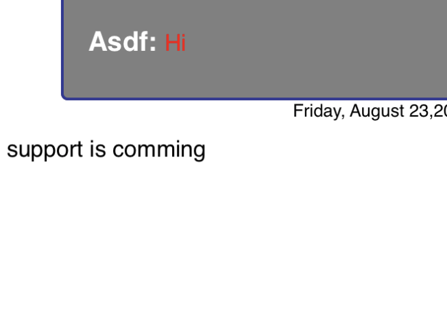 |
UIColor | UIColor.black | Lets you change the agent typing message text foreground color. |
| agentTypingFontStyle | UIFont | UIFont(name: "Helvetica", size: 17.0)! | Lets you change the agent typing text font style and size. |
| agentTypingMessageBackgroundColor | UIColor | UIColor.white | Lets you change the agent message background color. |
| agentTypingMessageBorderColor | UIColor | UIColor.white | Lets you change the agent message border color. |
| agentTypingMessageCornerRadius | int | 0 | Lets you change the agent message border radius. |
| agentTypingMessageBorderWidth | int | 0 | Lets you change the agent message border width. |
| agentTypingMessageAllignment | NSTextAlignment | NSTextAlignment.left | Lets you change the agent message text alignment. |
| agentTypingMessageTopPadding | Int | 0 | Lets you change the agent message top padding. |
| agentTypingMessageBottomPadding | Int | 0 | Lets you change the agent message bottom padding. |
| agentTypingMessageLeftPadding | Int | 0 | Lets you change the agent message left padding. |
| agentTypingMessageRightPadding | Int | 0 | Lets you change the agent message right padding. |
| agentTypingMessageRightPadding | Int | 0 | Lets you change the agent message right padding. |
| agentTypingMessageRightPadding | Int | 0 | Lets you change the agent message right padding. |
| agentTypingAccessibilityMessage | String | Lets you set the typing accessibility message. | |
| infoMessageLeftMargin | Int | 10 | Typing/System message view left margin. |
| infoMessageTopMargin | Int | 1 | Typing/System message view top margin. |
| infoMessageRightMargin | Int | 0 | Typing/System message view right margin. |
| agentNameFontStyle | UIFont | UIFont(name: "Helvetica", size: 17.0)! | Lets you change the agent name text font style and size. |
| agentNameTextColor | UIColor | agentMessageTextColor | Lets you change the agent name text color. |
| htmlLinkColor | UIColor | UIColor.blue | Lets you change url link color. |
| htmlLinkGreyScaleModeColor | UIColor | UIColor.blue | Lets you url color when device is in grey scale mode. |
| setSpaceBetweenBubble | Int | 0 | Lets you change the space between bubbles. |
isChatFromBottom 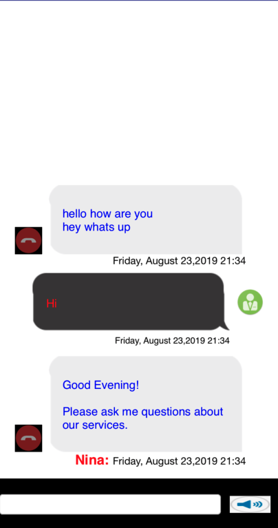 |
bool | false | Setting this to true render the message from bottom and pushes up as new messages arrives |
groupMsgs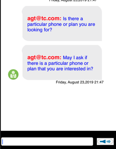 |
bool | false | Setting this to true group all customer and agent messages |
| spaceBetweenGroupingCells | Int | 0 | Set the space between the grouped cells |
| hugCustomerMessageContent | boolean | false | Enable content hugging for customer messages |
| hugAgentMessageContent | boolean | false | Enable content hugging for agent messages |
| delayRenderingVAResponse | Double | 0.1 | Allows you to delay the rendering of VA responses. |
Styling Transcript bubbles using background Image
Properties to set background streachable image to Transcript bubbles is exposed from MessagingViewProperties class.
Following properties in MessagingViewProperties lets you customize the conversation bubbles using background image.
| Name | type | default | description |
|---|---|---|---|
| setConversationBackgroundImage | Bool | false |
Use this property to turn on background image styling for transcript bubble. |
| agentBackgroundImageData | Data | nil |
Use this property to set the background image to agent transcript bubble. |
| customerBackgroundImageData | Data | nil |
Use this property to set the background image to customer transcript bubble. |
| setAgentBackgroundImageStretchingPoint | UIEdgeInsets | nil |
Use this property to change the agent background image strecting point. UIEdgeInsetsMake(15, 30, 20, 15) |
| setCustomerBackgroundImageStretchingPoint | UIEdgeInsets | nil |
Use this property to change the customer background image strecting point. UIEdgeInsetsMake(15, 30, 20, 15) |
Styling Speech bubbles view
Properties to enable and style speech Transcript bubbles are exposed from MessagingViewProperties class.
Following properties in MessagingViewProperties lets you customize the conversation bubbles using speech view. Speech view will also turn on background image for transcript bubbles (refer the above section).
| Name | type | default | description |
|---|---|---|---|
| setSpeachBubbleView | Bool | false |
Use this property to turn on speech transcript view |
| agentSpeechIcon | Data | nil |
Use this property to set te agent icon. |
| customerSpeechIcon | Data | nil |
Use this property to set customer icon. |
| ninaSpeechIcon | Data | nil |
Use this property to set te Virtual agent speech icon. |
| setAgentIconImagePosition | Int | 1 |
Use this property to set the agent spech icon position.
|
| setCustomerIconImagePosition | Int | 1 |
Use this property to set the customer spech icon position.
|
Persisting System Messages in Transcript
By default System Messages disappear after a new Agent or Customer message appear. But certain Systems messages can be configured to persist in the transcript.
| Name | type | default | example |
|---|---|---|---|
| persistTransferStartMessage | bool | false | Setting this property will make SDK to persist agent transfer start message in the transcript. |
| persistTransferConnectedMessage | bool | false | Setting this property will make SDK to persist agent transfer connected message in the transcript. |
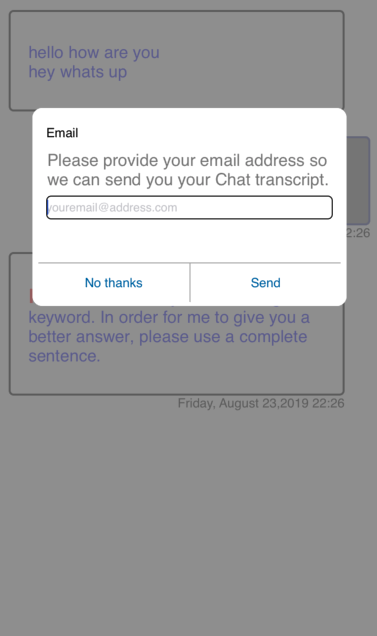
Styling Email dialog
Properties to customize Email dialog is exposed from EmailViewProperties class. Application has to pass an instance of this class having modified properties into the framework.
public func setEmailViewProperties(properties: EmailViewProperties)
Following properties in EmailViewProperties lets you customize Email Dialog.
| Name | type | default | description |
|---|---|---|---|
| transparentBackgroundColorOpacity | Float | .8 |
lets you change the opacity value of the modal background. |
| transperentBackgroundColor | UIColor | UIColor.grey | Use this property to change the modal background color. |
| backgroundColor | UIColor | UIColor.white | lets you change the email dialog background color. |
| emailPopupHeight | Double | 200.0 | lets you change the email dialog height. |
| emailPopupHeightAtLandscape | Double | 180.0 | lets you change the email dialog height when devide at landscape mode. |
| titleBarText | String | kEmailViewTitleText | Set this property to change the title bar text. |
| titleBarTextColor | UIColor | UIColor.white | Set the title bar text foreground color. |
| titleBarTextFontStyle | UIFont | UIFont(name: kFontName, size: 13.0) | Set the title bar text font style. |
| titleBarTextAllignment | NSTextAlignment | NSTextAlignment.left | Set the title bar text alignment. | descriptionText | String | kEmailViewDescriptionText | Set this property to change the description message. | descriptionTextColor | UIColor | UIColor.gray | Set this property to change the description message foreground color. |
| descriptionTextFontStyle | UIFont | UIFont(name: kFontName, size: 17.0)! | Set the description text font style. |
| descriptionTextAllignment | NSTextAlignment | NSTextAlignment.left | Set the description text alignment. |
| emptyEmailAddressErrorMessage | String | Please enter your email address. | Sets the error text that gets displayed when no email address found. |
| invalidEmailAddressErrorMessage | String | Please enter valid email address. | Sets the error text that gets displayed when email address validation fails. |
| errorMessageTextColor | UIColor | UIColor.red | Lets you change the error text foreground color. |
| emailErrorFontStyle | UIFont | UIFont.boldSystemFont(ofSize: 11.0) | Lets you change the error text font style. |
| errorFieldBottomSpacing | Int | 6 | Lets you change the space between error text and email buttons |
| errorFieldBottomSpacingAtLandscape | Int | 5 | Lets you change the space between error text and email buttons in landscape mode |
| emailHintText | String | youremail@address.com | Lets you change hint text displayed in the email input field. |
| isErrorImageRequired | Bool | false | Lets you configure the visibilty of an error info image. |
| emailErrorImageHeight | Int | 10 | Lets you configure the error image height. | emailErrorImageWidth | Int | 10 | Lets you configure the error image width. | emailErrorImage | Data | nil | Lets you configure the image displayed along with error message. |
| cancelButtonText | String | Cancel | Lets you change the Cancel button label. |
| sendButtonText | String | Send | Lets you change the Send button label. |
| cancelButtonTextColor | UIColor | UIColor(red: 15.0/255.0, green: 104.0/255.0, blue: 171.0/255.0, alpha: 1.0) | Lets you change the cancel button label foreground color. |
| sendButtonTextColor | UIColor | UIColor(red: 15.0/255.0, green: 104.0/255.0, blue: 171.0/255.0, alpha: 1.0) | Lets you change the send button label foreground color. |
| cancelButtonBackgroundColor | UIColor | UIColor.clear | Set the cancel button background color. |
| cancelButtonBackgroundViewColor | UIColor | UIColor.white | Set the cancel button background view color. |
| cancelButtonFontStyle | UIFont | UIFont(name: kFontName, size: 13.0) | Set the cancel button text font style. |
| sendButtonBackgroundColor | UIColor | UIColor.clear | Set the send button background color. |
| sendButtonBackgroundViewColor | UIColor | UIColor.white | Set the send button background view color. |
| sendButtonFontStyle | UIFont | UIFont(name: kFontName, size: 13.0) | Set the send button text font style. |
| buttonsViewHeight | Int | 40 | Lets you set the buttons view height. |
| buttonInBetweenBorderWidth | Int | 1 | Lets you set the width of the border in between buttons. |
| buttonViewTopBorderWidth | Int | 1 | Lets you set the width of the border between button view and error message. |
| buttonBorderColor | UIColor | UIColor.lightGray | Lets you set the color of the button border. |
| emailTextFieldCornerRadius | Int | 5 | Set the Email address Input field corner radius. |
| emailTextFieldBorderWidth | Int | 0 | Set the Email address Input field border width. |
| emailTextFieldBorderColor | UIColor | UIColor.black | Set the Email address Input field border color. |
| emailTextFieldColor | UIColor | UIColor.black | Set the Email address Input field text color. |
| emailTextFieldFontStyle | UIFont | UIFont(name: kFontName, size: 15.0) | Set the Email address Input field font style. |
| emailViewCornerRadius | Int | 10 | Set the Email dialog corner radius. |
| emailViewBorderWidth | Int | 1 | Set the Email dialog border width. |
| emailViewBorderColor | UIColor | UIColor.white | Set the Email dialog border color. |
| mailSentFailureErrorMessage | String | Sorry, problem with sending mail, please try again | Set the text that gets displayed when email request is failed. |
Loading Properties
SDK has properties exposed to display a loading while restoring the previous conversation. Application has to pass an instance of this class having modified properties into the framework.
ppublic func setLoadingViewProperties(properties: LoadingViewProperties)
| Name | type | default | description |
|---|---|---|---|
| showPreviousMessageLoading | Bool | false | Lets you configure the visibility of loading view. |
| backgroundColor | UIColor | UIColor.gray | Lets you set the loading background color. |
| backgroundColorOpacity | Float | 0.8 | Lets you set the background color opacity. |
| loadingMessage | string | kLoadingText | Lets you set the message displayed in the loading view. |
| loadingMessageColor | UIColor | UIColor.black. | Lets you set the loading message color. |
| displayTextInBold | Bool | false | Lets you configure if the loading text needs to be displayed in bold. |
| displayTextInItalic | Bool | false | Lets you configure if the loading text needs to be displayed in italic. |
| messageFontStyle | UIFont | UIFont(name: kFontName, size: 17.0)! | Lets you set the loading text font style. |
| showActivityIndicator | Bool | true | A light weight activity indicator. Style is not supported for this indicator. |
Messaging App String Properties
Properties to change the various default strings is exposed from CustomerInformationMessages class. Application has to pass an instance of this class having modified properties into the framework.
public func setStringProperties(properties: CustomerInformationMessages)
| Name | type | default | description |
|---|---|---|---|
| messagingNotAvailable | String | Messaging service not available at this time. Please try again later. | Sets the text which is displayed when messaging service is not available. |
| serviceQueued | String | An agent will respond as soon as they are available. | Sets the text which is displayed when engagement is queued. |
| agentNowAvailable | String | Agent now available. | Sets the text which is displayed when engagement goes from queue to assigned. |
| networkNotAvailable | string | Connection to messaging server is disconnected. Please check your network.. | Sets the text which is displayed when device network is lost during an active engagement. |
| networkAvailable | string | Connectiong to messaging server is restored. | Sets the text which is displayed when device network is restored. |
| serviceDenied | string | No agent available at this time. Please try again. | Sets the text which is displayed when no agents are avialble. |
| agentLeftConversation | string | Agent Left the conversation. | Sets the text which is displayed when agent closes the engagement. |
| agentTimedOut | string | Connection timed out due to InActivity. | Sets the text which is displayed when connection is timed out due to in activity. |
| closeButtonAccessibilityMessage | string | Close chat window. | Sets the text that voice over reads when accessibility mode is turned on |
| minimizeButtonAccessibilityMessage | string | Minimize chat window. | Sets the text that voice over reads when accessibility mode is turned on |
| emailButtonAccessibilityMessage | string | Send copy of chat transcript. | Sets the text that voice over reads when accessibility mode is turned on |
| chimeButtonOnAccessibilityMessage | string | Incoming chat chime, ON | Sets the text that voice over reads when accessibility mode is turned on |
| chimeButtonOffAccessibilityMessage | string | Incoming chat chime, OFF | Sets the text that voice over reads when accessibility mode is turned on |
| sendButtonAccessibilityMessage | string | Send | Sets the text that voice over reads when accessibility mode is turned on |
| startRecordingAccessibilityMessage | string | Start Recording | Sets the text that voice over reads when accessibility mode is turned on |
| stopRecordingAccessibilityMessage | string | Stop Recording | Sets the text that voice over reads when accessibility mode is turned on |
| InputTextAccessibilityMessage | string | InputText | Sets the text that voice over reads when accessibility mode is turned on |
| option1ButtonAccessibilityMessage | string | Sets the text that voice over reads when accessibility mode is turned on | |
| option2ButtonAccessibilityMessage | string | Sets the text that voice over reads when accessibility mode is turned on | |
| agentTransfer | string | Sets the text that will be displayed when agent Transfer happens either to VA or another agent | |
| agentTransferConnected | string | Sets the text that will be displayed when new agent joins | |
| agentLost | string | Sets the text that will be displayed when agent is disconnected from chat roomid |
Displaying Customer & Agent name in bubbles.
To display customer and agent name in the bubbles, please set showNameInBubbles boolean property of MessagingViewProperties class.
| Name | type | default | example |
|---|---|---|---|
| showNameInBubbles | Bool | false | Lets you display customer and agent name in the bubbles |
| defaultCustomerName | String | You | Use this property to set the default Customer name. This property is present in CustomerInformationMessages class |
| showNameInTimeStamp | Bool | false | Lets you display customer and agent name in the timestamp message |
Displaying and styling timestamp.
Below properties lets you customize the look and feel of the time stamp displayed underneath the Message bubble.
Properties are found in MessagingViewProperties class
| Name | type | default | example |
|---|---|---|---|
| setMessageTimeStamp | bool | false | Lets you set the display of timestamp underneath the message bubble. |
| setMessageTimeStampFormat | String | EEEE, MMMM dd,yyyy HH:mm | Lets you set the timestamp format |
| agentTimeStampBackgroundColor | UIColor | UIColor.white | Lets you set timestamp background color. |
| agentTimeStampTextColor | UIColor | UIColor.black | Lets you set timestamp text color. |
| agentTimeStampBorderColor | UIColor | UIColor.white | Lets you set timestamp border color. |
| agentTimeStampCornerRadius | Int | 0 | Lets you set the timestamp corner radius. |
| agentTimeStampBorderWidth | Int | 0 | Lets you set the timestamp border width |
| agentTimeStampFontStyle | UIFont | UIFont(name: "Helvetica", size: 13.0) | Lets you set the timestamp font. |
| agentTimeStampTextAllignment | NSTextAlignment | NSTextAlignment.right | Lets you set timestmp text alignment. |
| agentTimeStampLeftPadding | Int | 0 | Lets you set timestamp text left padding. |
| agentTimeStampRightPadding | Int | 0 | Lets you set the timestamp text right padding. |
| agentTimeStampTopPadding | Int | 0 | Lets you set the timestamp view top padding. |
| agentTimeStampBottomPadding | Int | 0 | Lets you set timestamp text bottom padding. |
| agentTimeStampLeftMargin | Int | 0 | Lets you set timestamp view left margin. |
| agentTimeStampRightMargin | Int | 0 | Lets you set the timestamp view right margin. |
| agentTimeStampTopMargin | Int | 0 | Lets you set the timestamp view top margin. |
| agentTimeStampBottomMargin | Int | 0 | Lets you set the timestamp view bottom margin. |
| customerTimeStampBackgroundColor | UIColor | UIColor.white | Lets you set timestamp background color. |
| customerTimeStampTextColor | UIColor | UIColor.black | Lets you set timestamp text color. |
| customerTimeStampBorderColor | UIColor | UIColor.white | Lets you set timestamp border color. |
| customerTimeStampCornerRadius | Int | 0 | Lets you set the timestamp corner radius. |
| customerTimeStampBorderWidth | Int | 0 | Lets you set the timestamp border width |
| customerTimeStampFontStyle | UIFont | UIFont(name: "Helvetica", size: 13.0) | Lets you set the timestamp font. |
| customerTimeStampTextAllignment | NSTextAlignment | NSTextAlignment.right | Lets you set timestmp text alignment. |
| customerTimeStampLeftPadding | Int | 0 | Lets you set timestamp text left padding. |
| customerTimeStampRightPadding | Int | 0 | Lets you set the timestamp text right padding. |
| customerTimeStampTopPadding | Int | 0 | Lets you set the timestamp view top padding. |
| customerTimeStampBottomPadding | Int | 0 | Lets you set timestamp text bottom padding. |
| customerTimeStampLeftMargin | Int | 0 | Lets you set timestamp view left margin. |
| customerTimeStampRightMargin | Int | 0 | Lets you set the timestamp view right margin. |
| customerTimeStampTopMargin | Int | 0 | Lets you set the timestamp view top margin. |
| customerTimeStampBottomMargin | Int | 0 | Lets you set the timestamp view bottom margin. |
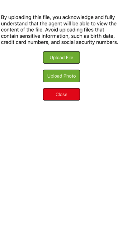
Styling FileUpload screen.
SDK exposes following properties to style File Upload screen
| Name | type | default | example |
|---|---|---|---|
| selectFileButtonBackgroundColor | UIColor | UIColor.color(hexString: "#7FB523") | Lets you customize select file button background color |
| selectPhotoButtonBackgroundColor | UIColor | UIColor.color(hexString: "#7FB523") | Lets you customize select photo button background color |
| closeButtonBackgroundColor | UIColor | UIColor.color(hexString: "#D90000") | Lets you customize close button background color |
| selectFileButtonTitleColor | UIColor | UIColor.white | Lets you customize select File button text color |
| selectPhotoButtonTitleColor | UIColor | UIColor.white | Lets you customize select Photo button text color |
| closeButtonTitleColor | UIColor | UIColor.white | Lets you customize close button text color |
| selectFileButtonBorderColor | UIColor | UUIColor.color(hexString: "#000000") | Lets you customize select File button border color |
| selectPhotoButtonBorderColor | UIColor | UIColor.color(hexString: "#000000") | Lets you customize select Photo button border color |
| closeButtonBorderColor | UIColor | UIColor.color(hexString: "#000000") | Lets you customize close button border color |
| selectFileButtonBorderWidth | Int | 1 | Lets you customize select File button border width |
| selectPhotoButtonBorderWidth | Int | 1 | Lets you customize select Photo button border width |
| closeButtonBorderWidth | Int | 1 | Lets you customize close button border width |
| selectFileButtonCornerRadius | Int | 1 | Lets you customize select File button corner radius |
| selectFileButtonCornerRadius | Int | 1 | Lets you customize select Photo button corner radius |
| selectFileButtonCornerRadius | Int | 1 | Lets you customize close button button corner radius |
| normalMessageTextColor | UIColor | UIColor.blue | Lets you customize info message text color |
| errorMessageTextColor | UIColor | UIColor.red | Lets you customize error message text color |
| Name | type | default | description |
|---|---|---|---|
| fileUploadDisclaimerText | String | By uploading this file, you acknowledge and fully understand that the agent will be able to view the content of the file. Avoid uploading files that contain sensitive information, such as birth date, credit card numbers, and social security numbers. | Lets you customize file upload disclaimer text |
| fileUploadSelectFileButtonTitle | String | Upload File | Lets you customize select file button text |
| fileUploadSelectPhotoButtonTitle | String | Upload Photo | Lets you customize select photo button text |
| fileUplaodCloseButtonTitle | String | Close | Lets you customize close button text |
| fileTypeNotAllowedErrorMessage | String | File type not allowed to upload. | Lets you customize type not allowed error text |
| fileTooLargeErrorMessage | String | File is too large. Please select a file that is less than | Lets you customize file size error text |
| fileUploadFailureErrorMessage | String | Failed to upload file. Please try later | Lets you customize upload error text |
| fileUploadRetryMessage | String | Failed to upload file. Please try again | Lets you customize upload retry message |
| fileUploadSuccessMessage | String | File successfully uploaded. | Lets you customize upload success message |
| fileUploadRetryButtonTitle | String | Retry | Lets you customize upload retry text |
| fileUploadCancelRetryButtonTitle | String | Cancel | Lets you customize upload retry cancel text |
| Name | type | default | description |
|---|---|---|---|
| displayProgressText | Bool | true | Lets you configure the display of progress percentage |
| progressTextFont | UIFont | UIFont = UIFont(name: kFontName, size: 10.0)! | Lets you customize progress percentage font |
| progressTextColor | UIColor | UIColor.black | Lets you customize progress percentage color |
| progressTextFormat | String | %.1f %% | Lets you customize progress percentage format |
| progressTintColor | UIColor | UIColor.color(hexString: "#3E70FB") | Lets you customize progress view tint color |
| trackTintColor | UIColor | UIColor.color(hexString: "#B6B6B6") | Lets you customize progress view tract tint color |
| progressViewHeight | CGFloat | 20.0 | Lets you customize progress view height |
| progressViewWidth | CGFloat | 250.0 | Lets you customize progress view width |
| displayMessageText | Bool | true | Lets you configure the diplay of progress message |
| messageTextFont | UIFont | UIFont(name: kFontName, size: 10.0)! | Lets you customize progress message font |
| messageTextColor | UIColor | UIColor.color | Lets you customize progress message color |
| messageText | String | Uploading | Lets you customize progress message text |
Styling Virtual Agent Response.
SDK lets you customize VA resposne in various ways.
Properties are found in MessagingViewProperties class
| Name | type | default | example |
|---|---|---|---|
displayNinaLinksAsButtons 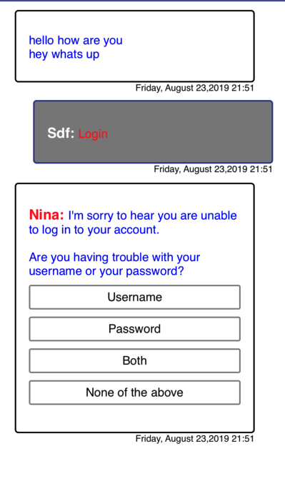 |
bool | false | Setting this property to true will display a nina links as buttons. |
| htmlLinkButtonFont | UIFont | nil | Lets you set the link button font. |
| linkButtonBackgroundColor | UIColor | UIColor.clear | Lets you set button background color. |
| linkButtonTextColor | UIColor | UIColor.black | Lets you set link button text color. |
| linkButtonCornerRadius | Int | 3 | Lets you set button corner radius. |
| linkButtonBorderColor | UIColor | UIColor.gray | Lets you set link button border color. |
| linkButtonBorderWidth | Int | 2 | Lets you set link button border width. |
| linkButtonBackgroundImage | Data | nil | Lets you set link button background image. |
| linkButtonTextAllignment | UIControl.ContentHorizontalAlignment | .center | This property lets you set the text button text alignment. |
| linkButtonLeftPadding | CGFloat | 5 | This property lets you set left padding of button text. |
| showFirstImageOut | Bool | false | Lets you display the first image from VA response out side above bubble. |
| vaImageBorderWidth | Int | 0 | Lets you style the border of the image which is displayed outside the bubble. |
| vaImageCornerRadius | Int | 0 | Lets you style the corner radius of the image which is displayed outside the bubble. |
| vaImageLeftMargin | Int | 16 | Lets you set the left margin of the image which is displayed outside the bubble. |
| vaImageRigthMargin | Int | 16 | Lets you set the right margin of the image which is displayed outside the bubble. |
| vaImageBorderColor | UIColor | UIColor.white | Lets you set border color of the image which is displayed outside the bubble. |
| vaImageBackgroundColor | UIColor | UIColor.white | Lets you set background color of the image which is displayed outside the bubble. |
| vaImageheight | Int | 100 | Lets you set the height of the image which is displayed outside the bubble. |
| vaImageMode | UIView.ContentMode | .center | Lets you set the content mode of the image which is displayed outside the bubble. |
| inlineBackgroundColor | UIColor | UIColor.clear | Lets you change the background color of the image displayed inline. |
| inlineImageheight | Int | 120 | Lets you change the height of inline image. |
| inlineImagewidth | Int | 160 | Lets you change the width of inline image. |
| inlineImageMode | UIView.ContentMode | .center | Lets you content mode of inline image. |
Displaying Disclaimer Header
Disclaimer text appears at the top of the chat window immediately after messaging window is displayed.
| Name | type | default | example |
|---|---|---|---|
| disclaimerText | string | Disclaimer text that is displayed on top of transcript area. |
|
| showDisclaimerHeader | bool | false | Configure SDK to display a disclaimer header. |
| autoHideDisclaimerHeader | bool | false | Configure SDK to hide the disclaimer after engagement is created. |
| disclaimerTextColor | UIColor | UIColor.black | Configure disclaimer text color |
| disclaimerTextFontStyle | UIFont | Configure disclaimer text font style | |
| disclaimerTextAlignment | NSTextAlignment | Configure disclaimer text alignment | |
| isAllignToBulletPoints | bool | false | Aligns bullet point relative to parent. If displayNinaLinksAsButtons is set to true alignment property will not work |
    Properties:
    showDisclaimerHeader: Bool = false
    autoHideDisclaimerHeader : Bool = true
    autoHideHeaderTime : Int = 3
    disclaimerText: String = ""
    disclaimerTextColor : UIColor = UIColor.black
    disclaimerTextFontStyle : UIFont = UIFont(name: "Helvetica", size: 14.0)!
    disclaimerTextAlignment:NSTextAlignment = NSTextAlignment.center
Displaying Survey Confirmation Dialog.
Use the below properties to show and display a confirmation dialog.
| Name | type | default | example |
|---|---|---|---|
| showSurveyDialog | bool | false | Setting this property turns on the confirmation dialog. Property is found in MessagingViewProperties class |
| customerSurveyAlertTitle | String | Welcome to customer satisfaction survey! | Use the property to change the title text. Property is found in CustomerInformationMessages class |
| customerSurveyAlertMessage | String | Kindly take part in this important survey measuring customer satisfaction. Your thought and opinions will be helpful in serving you better in the future. This survey should only take 4-5 minutes to complete. Be assured that all answers you provide will be kept in strictest confidentiality. | Use the property to change the survey dialog message. Property is found in CustomerInformationMessages class |
Additional Typing Customization
Use the below properties to configure the display of typing animation.
| Name | type | default | example |
|---|---|---|---|
| showTypingAnimation | bool | false | Setting this property to true turns on typing animation display |
| typingAnimationImage | UIImage | nil | Pass a list of images to be animated, UIImage.animatedImageNamed("Processing_", duration: 0) |
| typingAnimationImageWidth | int | 30 | Width of typing animation images |
| typingAnimationImageHeight | int | 30 | Height of typing animation images |
| typingAnimationImageLeftMargin | int | 3 | Set the animation images left margin |
| typingAnimationImageTopMargin | int | 2 | Set the animation images top margin |
| typingAnimationImageBackgroundColor | UIColor | clear | Set the animation images background color |
| hideStoppedTyping | Bool | false | Use this property to hide agent Stopped typing state |
| typingStaticImage | UIImage | nil | Use this property to set an icon for typing view |
| typingStaticImageWidth | int | 30 | Typing icon width |
| typingStaticImageHeight | int | 30 | Typing icon height |
| typingStaticImageLeftMargin | int | 3 | Typing icon left margin |
| typingStaticImageTopMargin | int | 2 | Typing icon top margin |
| typingStaticImageBackgroundColor | UIColor | clear | Typing icon background color |
Handling Minimized State
Please refer the Handling Minimised State section in the left Javascript Interface document.
Example
	     var vc:NuanceMessagingViewController;

        if(NuanMessaging.getInstance().getChatProgress()) {
            vc = restoreMessagingViewController(webview:nil);
        } else {
            vc = launchMessagingViewController(params: getEngageParameters())
        }
        setupMessagingUIProps(vc:vc)
        self.present(vc, animated: false, completion: nil)


        func setupMessagingUIProps(vc:NuanceMessagingViewController){

          var p4 = TitleBarProperties()
          let myImage1 = UIImage(named:"ic_action_close.png")
          let imageData1: Data = UIImagePNGRepresentation(myImage1!)!
          p4.closeImageData = imageData1 as Data
          let myImage2 = UIImage(named:"ic_action_mail.png")
          let imageData2: Data = UIImagePNGRepresentation(myImage2!)!


          p4.emailImageData = imageData2 as Data
          let myImage3 = UIImage(named:"ic_action_share.png")
          let imageData3: Data = UIImagePNGRepresentation(myImage3!)!
          p4.shareImageData = imageData3 as Data

          let myImage4 = UIImage(named:"minimize.png")
          let imageData4: Data = UIImagePNGRepresentation(myImage4!)!
          p4.minimizeImageData = imageData4 as Data

          p4.minimumSpaceBetweenTitleButton = 2;

          vc.setTitleBarProperties(properties: p4)


          var p1 = MessagingViewProperties();
          p1.isAgentIconRequired = false

          vc.setTranscriptViewPropeties(properties: p1);

          var p2 = EmailViewProperties()

          vc.setEmailViewProperties(properties: p2)

          var p3 = CustomerInputFieldProperties();
          p3.containerBackgroundColor = UIColor.black
          p3.borderColor = UIColor.lightGray
          p3.borderWidth = 2
          vc.setCustomerInputProperties(properties: p3)

          var p5 = SendButtonProperties()

          vc.setSendButtonProperties(properties: p5)


    }